CDT2020 - a CRM Data Visualization Web App
A visual and accesible platform for Hilti field team members to review and stategize their customer relationship-building activities.
NOTE: due to the internal functions of this product I can only describe the process.
Details
My Role
UX Design Lead
UX Techniques
User Workflow Design
Task Design + Analysis
Remote Usability Tests
Low-Hi Fi Prototyping
Design Guidelines
UI/Visual Design
Tools
Sketching
Illustrator
Photoshop
InVisionApp
Microsoft Office
Skype for Business
Duration
Nov 2014 - Jun 2015
Overview
Hilti direct sales and field engineers rely on many disparate datapoints found in multiple places to make sense of what is happening with their customer accounts. Often, they struggle to keep track of what is going on and how to best strategize their efforts. Yet, all the information they need can be found in Hilti's CRM system, but it is often hard to find and difficult to see the patterns in the data tables. So, we wanted to help these field members by creating a system that brings all information into one place and visualizes it to make the data easier to decipher and actionable.
Outcome
After just barely over a month in as Hilti's first UX designer, I was charged with leading the UX of a global project that was already far along. My opinion of involving end-users in the process was both controversial and challenged by my team - but through involving the team in my iterations of remote usability testing, they came to see the value of user-centered design. We were able to incorporate this feedback to shift the design away from the initial inside-out business proposal to create a system that centered on true end-users' needs.
Ultimately:
- We were able to create an intuitive, data-dense yet accessible system that is now actively used by tens-of-thousands of Hilti field members around the globe in over 110 countries.
- The success of this work inspired active end-user involvement in several other Hilti product projects afterwards.
- I was asked to give a special presentation for the entire IT community, explaining the user-centered process and how this lead to a better user experience, which made for a more successful product.
- My advice to do good user research at project beginnings, changed the direction of an exploratory project on how to improve Hilti's field team CRM experience. I was brought on as the sole researcher for the US market, where I conducted 9 fieldteam ride-alongs, then delivered my insights to the global team.
My Contributions
- Collaborated with the business team to leverage their expertise in the product design.
- Negotiated with the team to include several design iterations in our project plan.
- Wrote design communiques to educate the team and management on design methodology.
- Designed prototypes from low-to-high fidelity, iterating based on user feedback and best practices.
- Set up remote usability test sessions with field members across the US and Europe and conducted all of them.
- Transcribed test recordings, analyzed data, and shared insights with the team, providing my recommendations.
- Worked directly with development to translate the design into the code.
- Created design guidelines for development, and for future developers.
Process Work
I created 4 main design principles for the team to follow throughout the project. Coming to these four principles took time discussing with the team and stripping off all the business jargon of what we wanted this system to achieve, and how we best wanted to get there.

Initial wireframes I used for early feedback - and to discover if the scenarios we thought were the most important were actually the core scenarios and conceptually intuitive.

I remote usability tested with Hilti's field engineers and account managers from around the world, our target end-users. I designed tasks based off our validated scenarios and facilitated think aloud sessions. My team was not convinced yet of the usefulness of usability testing on a prototype, so I invited them to audit each user test and ask questions at the end. I also transcribed all recordings and made feedback-based recommendations and shared these with the team and stakeholders. By the end of the first round, no one was against usability testing anymore.
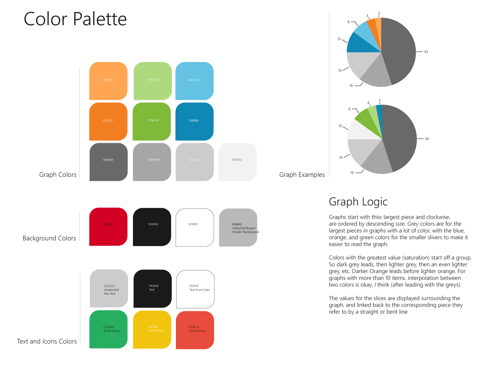
I created detailed UI design guidelines to communicate to the dev team how to best create CDT2020, including added rationale for the guidelines as this sort of thing was new for Hilti, and I was being challenged by developers who wanted to know why we were doing things differently.

